Tuesday, November 29, 2011

Currency

I was thinking about money symbols a while back, and the purpose of the strikethrough that seems to be the signifier of currency. What was its original meaning? Is it still compulsory to have this appendage? For it seems to me that it has gone the way of the vermiform appendix: a vestigial thing that no longer serves a function but is nevertheless just there.


Researching the origin and meaning of these strikes, I came across this article, "Evolution of Currency"
(What Ever Happened to the Double Strike on Currency Symbols?)

Refinement for the small screen during the 80′s saw the double strike vanish from the pound sterling mark, the dollar mark, the yen and also more recently the euro. This is understandable, as pixel density on screen fonts was vastly limited in the days of the computerised financial revolution. A maximum of 7 lines in height were available to build a font. It’s not say that all fonts now have removed the double strike, in fact most fonts have double strike for yen and euro, for pound and dollar it’s a different story however.
If you go back 20 or 30 years, there is no trace of the single strike on the pound and dollar. Even greengrocers, in their worst handwriting would strike twice. It’s a form, not a style. Two strikes denotes currency. A design language if you will. With the switch to DTP, the quest for new fonts began. The majority of early computer fonts were designed to be read at 7 lines high, which in turn lead to the single strike in publishing fonts, shop displays and other forms of currency denotation. All of these fonts are born from screen readable fonts, for the most part, and need to work well at 7 lines just as they do at 7 meters high.
ruble
This is the new Ruble character.
It keeps the all important double strike, which is the un-official form of world currency, but it kinda looks like a railway company logo don’t you think? I could imagine network rail rolling this one out for 2008.
Even though this symbol is championing the staple of the double strike ethic, they have taken an unimaginative leap to use the R (which stands for Ruble, as Y does Yen, E does Euro).

The Latin alphabet doesn’t really lend it’s self too well for augmentation. Take the dollar the pound symbols for example. These marks have nothing to do with the currency in a literal sense. The “S” with it’s two strike through’s in the dollar comes from the Spanish coat of arms, the two Pillars of Hercules and was passed to the U.S.A from Spanish-Mexican traders in the 1770′s.
The “L” in the pound on the other hand simply comes from the Italian Lira, with two strike throughs to differentiate. (other UK currency symbols come from Roman words, “d” for example comes from “denarius“, or penny.)
So one form came from abstraction, another from literal intent. Both ended up with the same design doctrine. As screens become denser in clarity, shouldn’t this international design form be kept? It seems a shame to drop the two instigators of this pattern from history, when new symbols try to inherit their form.

Fascinating! I had been thinking there was some semiotic significance that perhaps harkened back to earlier means of trade between different countries with different currencies, but it could have just begun as a practical, or aesthetic, means of making the mark disctinct. And what a beautifully simple method.


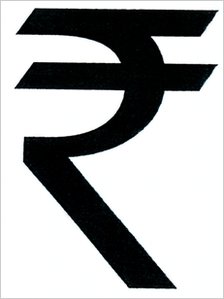
Speaking of beautiful, the fairly recently designed symbol for the Indian Rupee is, in my opinion, gorgeous. And, like the Yen symbol, also represents a visualcultural aspect of the country's culture (it is partly designed after the Hindi consonant "Ra":  र ).


Well, now I'm feeling positively capitalistic. But I'm sure I am in good company in my love of currencies of the world...

Friday, November 25, 2011

Deconstructed Bodies

Paintings by  João Figueiredo


These paintings have a quality of Moholy Nagy collages (see below). Really shows the artistic and moreover technical process in art-making, of which I am always a huge fan! These are beautiful, and interesting from a postmodern perspective, examining the "inner" workings and measurements of classic paintings, but instead of being ironic or trite, they pay homage to those works while creating something new.


Wednesday, November 23, 2011

The Human Camera: Stephen Wiltshire

I watched a television documentary in the library today, when I was feeling too ill to do much else. It was entitled simply "The Human Camera", which of course immediately caught my attention.

As it turned out, it was not about some experimental interior photographic art, but a man named Stephen Wiltshire, who is an autistic savant with the incredible gift of not only being able to study and memorize scenes-architecture specifically, but then render them almost photographically accurately.

However, it is not this gift alone that I found so awe inspiring. It is the fact that art, and the passion he had for making art from the age of 4-5 has given him a life that is full, fulfilling, and dynamic, and it has transformed who he is. This is the beautiful thing about art: it not only gives one opportunities to express oneself, it truly has the ability to be therapeutic, to rehabilitate, to bring us back into the wider world when we may have been locked in our own. It may be strange to think about it that way right now in art school, where it seems like everyone is necessarily in their own little world, at work, most of the time.
But when we do step back and then engage with others, how open it is! One's moments of intense introspection give way to a flood of new ideas once in discussion or collaboration with others.

Anyway, I can't think of much more to say on the program, other than that it made me cry. Human perseverance and the healing power of art, what more can I say?

Stephen Wiltshire has a gallery in London, and his website is HERE.

Monday, November 14, 2011

Chatelerault

I accompanied my friend, who was intent on continuing a project he had recently undertaken in Chatelerault. I took some reading, my camera, and my notebook with me, thinking I would have ample time to do what I needed to get done while my friend worked. However, the search to find the precise location in which he had worked was, of course, never-ending. Somewhat miraculously, we finally found his little batch of trees, by which time the sun was three-quarters of the way down the western sky. Needless to say, neither of us got terribly far in our own work. However, it was such a gorgeous day that I was quite happy to simply capture the warm afternoon and evening light that was throwing its rays through the trees. My attempts to use tree branches as a tripod produced mixed results, particularly with the long exposures, but I'm reasonably happy with a few of them, even if I only had my portrait lens with me (I NEED to get a moveable lens!).


Saturday, November 12, 2011

Debate on Learning the Arts

I recently had a discussion with two friends after hearing some abysmal compositions by composition students at the Royal Conservatoire of Scotland. They were all hell-bent on becoming the new Schoenberg,  with plinks and plonks running hither-thither, with seemingly no real notion of why one musical statement should come before or after another, or why come back to a "main theme". It struck me that these students had likely listened to and practiced a very specific course of musical history, and that they seemed to have never learned the basics of putting together an extended piece of music, based in classical tradition. I remarked upon this, subsequently expressing an old belief of mine in learning the "classical" approach to both music and visual art, learning its long history, before developing one's own particular style. My statement was gradually shot down by my friends. Damian, who is a composer, obviously came from the musical side of the issue, and as he saw it, if someone had listened to only one genre and created great music of that particular genre, it shouldn't be disregarded simply because of the limited scope from which it was created. Eugene, an art history student, disagreed with my admittedly academically inclined perspective, arguing that visual art could feasibly be created in a vacuum, without any external knowledge of other existing art, because it is a human impulse to create and express visually. I have to agree with this point, and I will concede that my long-held but never-analysed theory has deep flaws in its logic, and needs to be amended. And how could I have been so narrow-minded when I adopted this belief years ago? I can remember when it was formulated in my mind: a summer intensive course in which I took a painting class with students who wanted to paint the live models "their" way, as opposed to focusing on first getting a full understanding of what they were seeing and translating to canvas. Here I was thinking almost solely in terms of the exclusively Western, traditional ways of "Art-Making", in which one must painstakingly learn the craft of making a pretty picture, practicing after the patriarchal canon, for the ultimate goal of being a "good" (aka well trained and disciplined) artist. It is a notion which also suggests that "good art" is necessarily made by an Artist Who Knows What (S)He Is Doing. Yes, there is a hugely vast range of art made throughout history and modern day by people who studied its history and developed their skills according to that canon, but what of non-Western art? Does the fact that a craftsman from an African nation probably has never drawn or painted from a nude model diminish his work, or the effect it has upon the beholder? No, of course not. And what of those unique art-makers, who through some mental or spiritual 'spark' began making art out of the blue, simply because they had to? I've always been a proponent of art as an ultimate means of expression, and yet I had unwittingly been censoring that idea with one that said without the correct training, such expression would be insufficient.

I will say, however, that a well-rounded education that includes and utilizes historical contexts does have an effect of simply making person more informed about where one can potentially go in their artistic/creative practice. As opposed to making in the here and now, with no looking backwards or forwards. Perhaps knowing about the past is the reason we can analyse our practice and look to our own future.

Wednesday, November 2, 2011

Sunday, October 30, 2011

Contact Lens

Installation by Haruka Kojin


I love this. It's almost a tangible, technical version of a Susan Derges:

...And some of my own, from 2010:


I seem to love any aspect of the photographic process made accessible/tangible/apparent. And of course I love when one's image becomes distorted! Hence my use of concave mirrors in photos a while back. One day I'll come back to them.

Wednesday, October 26, 2011

more moholy-nagy


Moholy-Nagy's aesthetics I just find impeccable. And his inventiveness, his curiosity, is absolutely an inspiration (hey, I may start building boxes, light boxes, light constructions, WHO KNOWS WHAT next...)


I am mesmerized.

Saturday, October 15, 2011

I can see a woman crying

 video piece by Rineke Dijkstra.
A wonderful observation of children, and the early days of, erm...art analysis

Sunday, October 9, 2011

Thinking of cameraless Photography

At the end of my time at Goucher College, I was working on color photograms. Inspired by the black and whites ones by Lazlo Moholy-Nagy, I used glass, light gels, and a prism to manipulate light from the darkroom enlargers to create forms, and experiment with what colors would be created when exposing through such materials.


 Works by Pierre Cordier


Works by Adam Fuss

But there is so much more to explore! Beyond the darkroom, and the light from an enlarger, artists have been using nature, seeking outdoor settings and using naturally occurring sources to not only create arresting patterns, but to push the boundaries of what the "photograph" can mean.
This article from the Independent discusses artists like Garry Fabian Miller, Susan Derges, Pierre Cordier, and Floris Neusüss, who, "By removing the camera, [...]get closer to the source of what they are interested in: light, time, traces, signs and visions – things which have spiritual and metaphysical rather than simply physical qualities. Laying down the camera frees them from documentation to become, like alchemists, more focussed on transformation."


Works by Garry Fabian Miller

Even though they all deviate from the camera, these artists' motives, means, and approaches to their work could not be more disparate. Their work, and some of the thinking behind it, can be seen in these short but highly revealing videos at the V&A website:

>Garry Fabian Miller

>Floris Neusüss

>Pierre Cordier

>Adam Fuss

Friday, September 30, 2011

Susan Derges

Chladni figure, 1985
"I started to make some images where I caused the photographic paper itself to undergo an event. In the first instance it was to vibrate the photographic paper in the darkroom with sound and to allow powder on the surface of the paper to form into a series of patterns that were called 'chladni' figures."
The Observer and the Observed, 1991

Tuesday, September 13, 2011

Paper sculptures, tributes to literature and the creative impulse


Anonymous sculptures created out of books with notes "in support of libraries, books, words, ideas..." have been popping up around Edinburgh's libraries, and even a cinema. More information HERE. These fill me with such joy. Art being borne of a love of other types of art, for the sole purpose of giving back in spirit. It is such a beautiful (not just aesthetically beautiful) thing to see.

Wolfgang Tillmans


A constant plight of the art student is that everything has already been done before. Exhibit A: Mr. Tillmans. He has stolen my ideas, and made them 1,000,000,000,000X better. Dammit to hell!

Sunday, September 11, 2011

Ulf Lundin: From Darkness


(2002) The people that I portray in this series have been sitting alone by themselves in total darkness and haven’t been aware of when the picture will be taken and the flash would lighten up their face. In traditional photography portraiture there is a romantic impression that the photographer should capture the true personality of the person in front of him in one single picture. Here the starting point is the opposite.

Sunday, August 28, 2011

Yves Klein


I'd post his Anthropometries work, but the use of seemingly only attractive females to create the art really irks me.

more fire paintings (as well as about everything else!) at yveskleinarchives.org

Thursday, August 18, 2011

PHOTO-IDEA
play with context of images to challenge preconceived ideas of how to view art.

IDEA: photographs part of candy wrappings. (inspiration comes from Untitled (Portrait of Ross in LA) by Felix Gonzales-Torres) Evokes two senses, that of sight and of taste, and depending on the candy's familiarity to the "viewer", interrupt the associations one makes with the sweets.

IDEA: a narrative selectively, and incompletely, segmented into disparate frames. Challenges the idea that the Frame is the signifier of completion, a summariser; because there is always a story beyond the narrow view.

Monday, July 25, 2011